Amy and Jack Williamson cultivate an aura of gentility in Arcadia.
If you think back to your 10th grade World Civilization class, you’ll remember the story of Leonidas, the Spartan king who defended the pass at Thermopylae with his famous army of the “Three Hundred.” Moving through the wide gates onto the neck of Knoxville’s Arcadia Peninsula, you can’t help but be reminded of the Greek battleground and the heroes who fought there.
Amy and Jack Williamson’s home, on Leonidas Way, echoes this sense of history and permanence.
Faced in full-bed Tennessee limestone with natural slate rakes, the home is nestled into Arcadia’s rolling landscape with sweeping views of the lake and surrounding countryside. Your eye is immediately drawn to enormous stone corbels which support sloped limestone lintels over the windows. This design element, along with sweep siding and hand-hewn timber support beams, creates an appearance of by-gone grandeur.
Both Tennessee natives (Amy is from Kingston and Jack from Maryville), the Williamsons began construction about three years ago and moved in this past March. They wanted a home that would allow them to entertain friends and provide plenty of room for their sons Tyler and Blaine.
The home has two wings connected with stone arch and wooden barrel-ceilinged hallways. It’s an inviting style that affords plenty of space and privacy and opens up the center of the house. This open plan gives an easy flow from kitchen, to main living area, out to the patio, pool, then down to the fire pit and dock.
“I really love building houses,” says Amy. “This is our third one, and we had such a terrific experience with both our architect Shawn Fisher and our builder David Ivey.”
Jack found the property a few years ago; he and Amy loved the fact that it is so close to everything while still feeling secluded. “This is the last large house we’ll probably build with our sons headed for college soon,” says Amy.
As you enter, you are greeted with a pleasingly unusual entryway—a brick herringbone foyer and an Old World stone arch hallway running to both your left and right. You are immediately in the heart of the house, the large living room with glass door onto the patio and the stone-faced kitchen to your left.

“I knew that we wanted to see that beautiful floating staircase and to expose lake views from all rooms,” says architect Fisher. “And I wanted to be sure that the master suite was private, off to the side out and of the way.”
This room, with its high white ceilings, timber frame detail and grand twin chandeliers, is decorated in a style that decorator Liza Dewald describes as “charming casual.”
The large Marvin windows and glass doors offer an uninterrupted view of the pool and lake. “More and larger windows are the trend in today’s modern homes,” says Bryan Davis of HomeChoice Windows and Doors. Vintage Parisian doors flank the fireplace, sourced by Brad Johnson at Willow Creek Gallery. They were refinished in Knoxville and completed with mercury glass fronts by Laura Goff Designs.
The furniture layout is one of Dewald’s favorites —two large sofas facing each other with two chairs facing the fireplace. “I think this makes for a great conversation space,” she says, “and also a great place to stretch out and watch the game!” Wide, eight-inch hickory flooring runs throughout the house and is set apart from its more mundane cousins by a wealth of knots and a sanded and distressed finish.
The covered patio space right outside the living room has a full outdoor kitchen with wood surround and massive gas lanterns over the island. “Jack wanted a really big grill!” says Amy. You can see that the Williamsons are serious entertainers. Additional seating faces a gas fireplace with steps down to the pool house and infinity pool, the edge of which lines up with the lake view. Doors on either side of the stone fireplace lead into the dining room and main master suite respectively. A “soldier course” of vertically arranged thin pieces of slate sit atop the doors leaning into the house, lending intriguing visual interest to the back stone wall. One of the home’s signature touches—support columns set at a 45-degree angle, add distinctive a look. A gently curving stone walkway leads down from the pool level to a second, lower level stone patio with Adirondack chairs surrounding a rectangular gas fire and facing the lake.
“We used natural grey Tennessee sandstone for both the patio and pool surround,” says Kent Everett of Castone. “It’s a very hard rock, and can be a challenge to cut, but it’s very durable. The variations in color are a result of the slightly different locations it was quarried, which really adds to its beauty.”


The kitchen has an inventive feature that was Amy’s idea. Instead of the more typical rectangular island, with chairs along one side, Amy embedded a generous three-sided banquette into the middle of the kitchen island space. It provides comfortable seating, plenty of counter space, and a convenient casual dining area.
The back wall of the kitchen, faced in a thin-cut sandstone and a herringbone brick backsplash, has a custom hood from DuMond Iron over the Wolfe range from Ferguson’s. “I wanted to bring in texture and warmth,” explains designer Dewald. “Amy and I really wanted to bring character into each space.”
The pantry design is ingenious. It runs horizontally behind the entire width of the kitchen. Not only providing spillover counter space and an extra-large stone sink, it serves as a service area of sorts behind the kitchen. The “coffee bar” with all the essentials sits behind exquisite custom cabinetry fitted with the same mercury glass fronts found in the great room. This area keeps appliances close at hand but out of sight. The laundry room leads off this space, tucked away behind a sliding barn door.
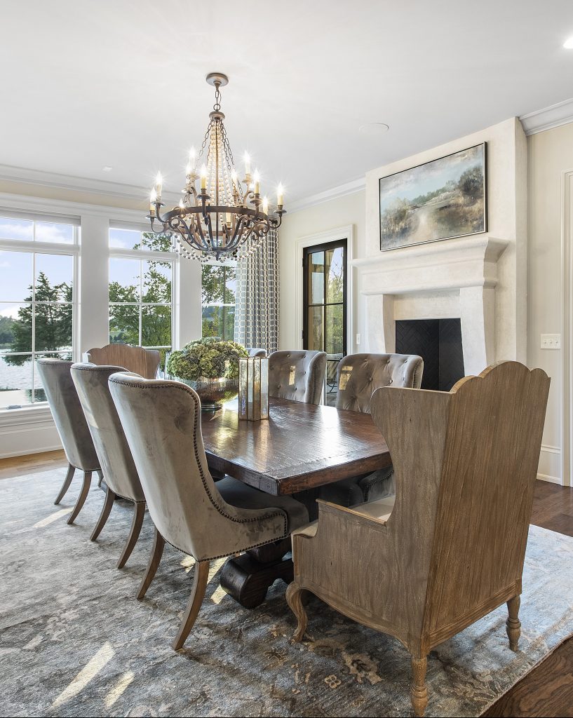
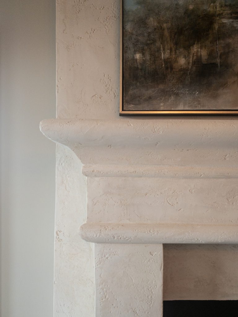
In keeping with the theme of casual entertaining, the dining room is open to the kitchen and living space. It overlooks the lake and, like many rooms in the home, has a gas fireplace. The painting over the mantel, by local artist J. Austen Jennings, was commissioned specially for the house and is reflective of the view from the room.
Large open-plan houses can be a challenge to decorate, as one room flows to another. Dewald shared her secret for the large spaces. “I carry the same colors throughout, but what is a wall color in one room may be the trim color in the next,” she explains. “Or, I may take a trim color in one room, and use that for the custom cabinetry.”

The Williamsons decided to locate two separate suites on the main level—one on each end of the barrel-ceilinged hallway. Since Amy’s father, Stan Branson, lives on Nubbin Ridge, and Jack’s mother, Carolyn Williamson, lives in Maryville, Amy doesn’t expect their parents to stay overnight very often, but it’s a great solution for house guests.
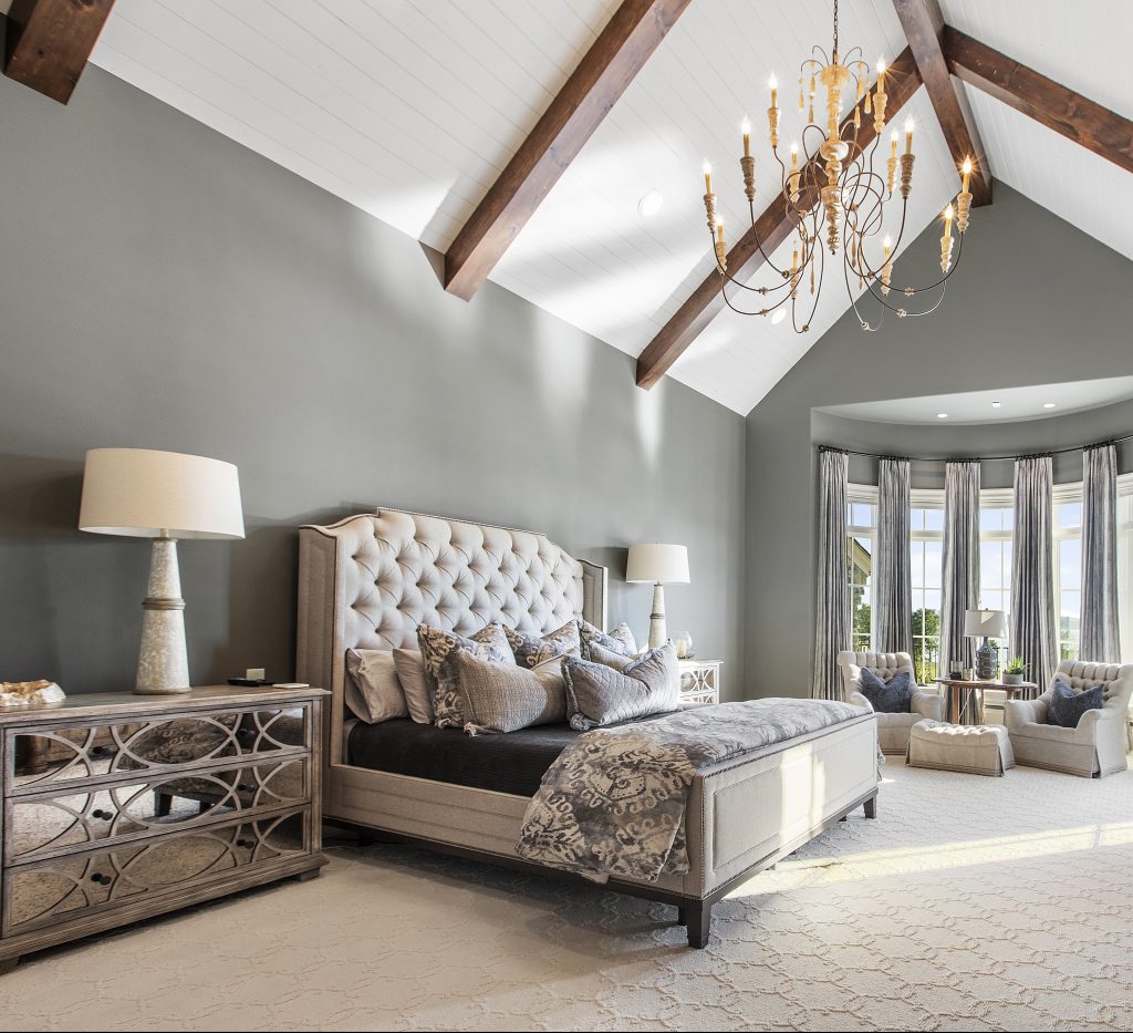
The first thing you notice is the breathtaking curved wall of windows overlooking the lake. The very high ceilings use timber beams and a grand chandelier to add texture and an English country look to the room. With neutral carpeting and tall windows, Amy decided to be bold with the wall color, setting off these elements with the charcoal grey walls.
The master bath is just the right size—spacious without feeling cavernous. The spa feeling is accentuated by the light grey color scheme, soaking tub with lake view, and large shower. The tile is perfectly set by the experts at Cella Flooring. Windows in the shower are set high, providing plenty of light without sacrificing privacy, and the cabinets are finished in the same grey as the bedroom walls.
The built-in vanity sits to the left of the door and leads into Amy and Jack’s closets. “I really wanted a girly closet,” laughs Amy. “I just love this square chandelier over the island, and the glass-fronted cabinets make it feel elegant.” A Place for Everything did the closet designs throughout the house.
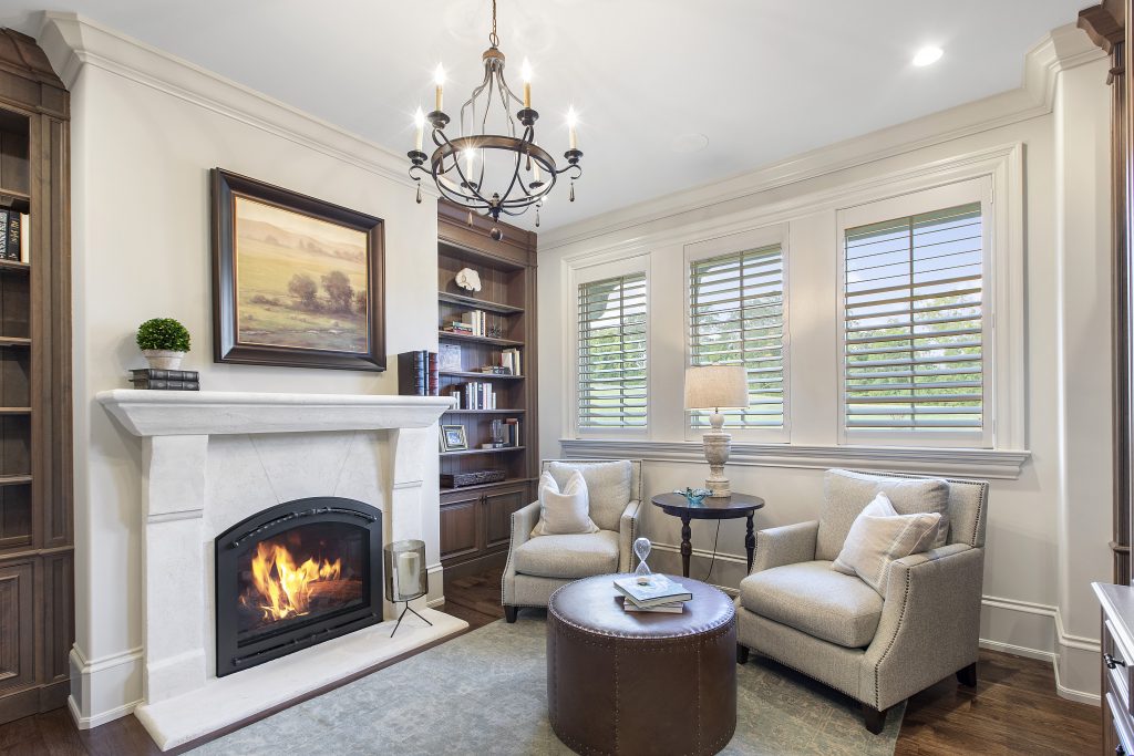
The main floor guest room is slightly smaller, but still boasts beautiful lake views, a walk-in closet, and generous bath. “Locating this guest suite near the staircase and opposite the office allows for plenty of exposed light and a real sense of privacy,” says Fisher. “I was always struck by the way even large houses, like Biltmore, can make spaces feel cozy. I think the rounded walls and arched ceiling add that intimate feeling to this space.”
Everett points to these stone archways as his favorite part of the house. “I think they add a historic feeling to the hallway,” he says. The back staircase behind the kitchen has a graceful custom railing from Dumond Iron and leads up to the second floor, where both boys have their bedrooms and a large bonus room for entertaining friends. With lake views and a full bath, it can be used as an extra bedroom if needed.

The guest room décor, in navy blue and brushed gold, was inspired by the sui generis navy-and-gold vanity that Dewald found at Fergusons. “We both just loved it,” she says, “and we designed the guest room theme from there.” This guest room has what Amy calls her “Vegas shower,” and the brushed gold and modern tilework does indeed remind you of one of those razzle-dazzle hotels on the Vegas strip.

Tyler’s room, decorated in greys and neutrals, has a wide lake view, a masculine bathroom, and walk-in closet. Amy used a wood-look tile for the bathroom flooring that’s beautiful and practical for this space. Blaine wanted a more “industrial flair” for his space. This room, in lighter greys, has a seating area adjacent to his room that the family jokingly calls Blaine’s lounge. This is an open area, close to the home’s elevator and back spiral staircase, with a seating area, fireplace, and television—a great rainy-day nook to read a book or watch a movie.

One of the home’s most magnificent features is the main spiral staircase that runs from the second floor down into the lower level. Its wide steps have a low rise, which prevents the slightly dizzy feeling some people get when going down a spiral staircase. The risers are faced in brick, which matches the historic feeling of the arched hallway. The dramatic double chandelier, hung in the center from a single large chain, would look perfectly at home in a grand English country house. “That chandelier didn’t quite work when it arrived,” says builder Ivey. “We worked with Tuck Dumond of Dumond Ironworks to re-design it on site. This staircase may be my favorite part of the house.”
At the bottom of this staircase is a large family and game room. Outfitted with three large comfortable sofas in a U-shape, this seating faces a media wall of five televisions. “Jack likes to be able to see all the games at once,” laughs Amy.

This large space also has a pool and game table, as well as a smaller-scale full kitchen, a workout room, and a golf simulation room.
“When I work with clients, they will tell me the things that are important to them, for example, a large pantry,” says Fisher. “I work with the landscape and sight lines to develop a plan that meets both their functional and aesthetic vision. It’s such a satisfying process to see a client’s vision come to life and know that we’ve accomplished something wonderful together.”
“We knew this would be our ‘last hurrah’ before the kids left home,” says Amy, “so we really wanted it to be a place that they and their friends would enjoy. Working with Shawn, David, Liza, and all the many talented people who helped us was a sheer joy. It’s only been a few months, but it already feels like home.”

Comments are closed.