Ron and Stefanie Houser embrace an ethos of gracious living
When Ron and Stefanie Houser began planning their new home, they wanted to echo the stately antebellum houses they had admired while vacationing in Charleston. Their home in the Beau Monde section of Northshore Town Center is a lovely combination of Charleston charm and modern convenience. In 2017, they found a location they loved in Northshore Town Center, but it was already under contract. Ron told the developer, Mike Stevens, that he was “on deck” should it ever become available. As luck would have it, the prior sale fell through, and Ron and Stefanie worked with architect Matthew Cox to build the home they had envisioned for so long.
A Legacy of Legare Street
The view from the street is striking. Classic two-story covered porches combined with simple columns, black Pella windows, and shallow roof lines evoke images of long summer afternoons, iced tea in tall frosted glasses, and conversation with friends. The Woodhaven Tudor brick from General Shale with white mortar plays off the Charcoal Black roof and guttering in a linen color. The landscaping from Versatile Landscapes is simple and elegant. This is an architectural style associated with Charleston, where property taxes resulted in many homes built one room wide with double covered piazzas (Charlestonese for porch). The Housers were so inspired by a house in Bluffton that they purchased the rights to the exterior, and the result is spectacular.
A Sense of Welcome
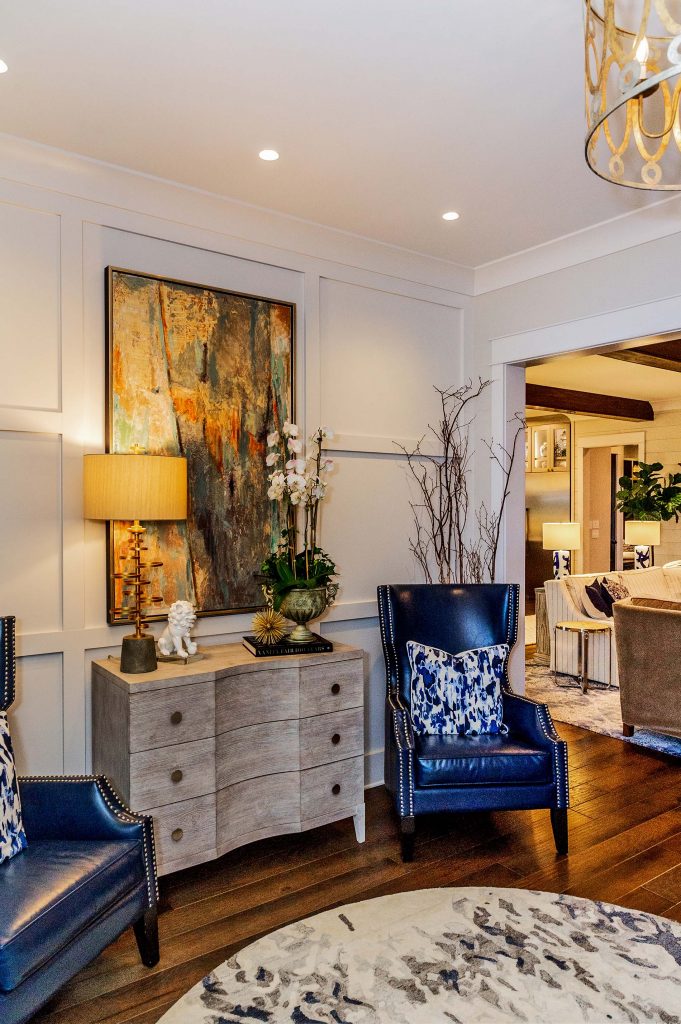
Walking in the front door you are immediately greeted by a striking hammered metal light fixture in the foyer and compelling artwork on the wall to your left. “We loved that piece of artwork so much,” says Ron, “that we had the molding built to frame it.” Whenever Stefanie would go home to visit her mother, she would always shop. “I love looking for décor with my mother,” she says, “many of the antique metal and other light fixtures in the house are the result of my shopping trips with mother.”
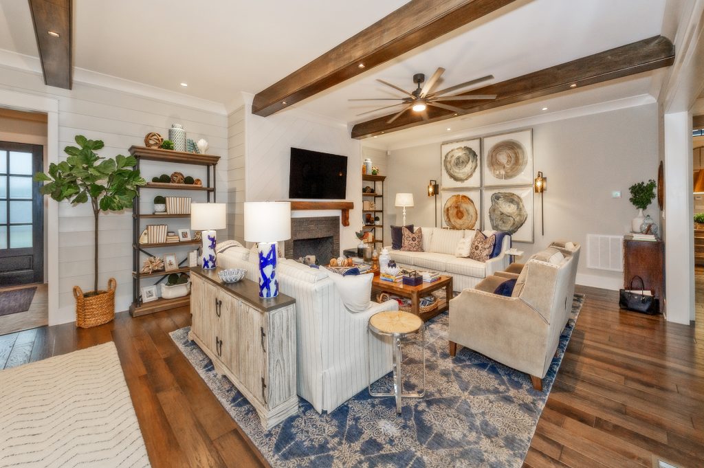
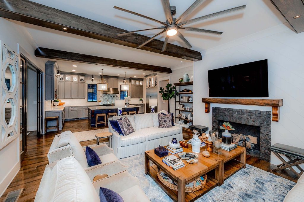
The home opens up into a large open space that serves as the main living area, with the kitchen and dining room to your left. The main fireplace, with Rumford-style fire rock from Fireside Hearth and Home, is on the facing wall and is surrounded by a combination of horizontal and diagonal shiplap, which gives the recessed areas on either side of the hearth a nice dimension. The mantel, from Smoky Mountain Lumber, is constructed from a piece of antique wood. “We vacation in Charleston, and we knew that we wanted that style reflected throughout our home,” says Stefanie. “Our designer, Paige Stephens, was marvelous in interpreting that style.”
The Heart of the Home
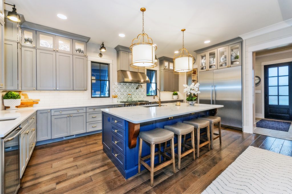
“We started with the kitchen,” says Stefanie, a part-owner of Soccer Taco. “We both love to cook, and we wanted to build the activity and energy of our home around the place where everyone always gathers.” The Housers used professional series Thermador appliances from Ferguson’s to create a kitchen that makes entertaining fun. Stefanie’s mother’s collection of Blue Willow-ware is highlighted in the Oyster and glass-front custom cabinetry from Dixie Kitchen. The ten-foot island in Statuary Classique from White’s Marble Works is balanced nicely by two large light fixtures in the metal-and-glass theme used throughout the house. The industrial Brizo faucet and knurled brass drawer pulls are a nice counterpoint to the softer finishes used in this area.
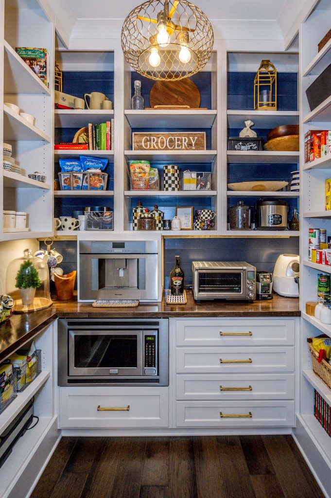
One of the most delightful design concepts of the house is the pantry. Set behind a wood-and-glass door and tucked out of sight, this space serves double duty. Not only generous storage for traditional pantry items, it is also a “work room” of sorts, housing the appliances we all use, but don’t necessarily want to have cluttering up our counters. The microwave, espresso and coffee machine, stand mixer, and so forth are all handy and set up for use, not simply stored. The room has a large window in addition to the glass door into the kitchen and is very light and airy. As with many of the “working rooms” of the house, it has its own stylish chandelier. It’s a wonderful idea.
This idea has a counterpart on the other side of the kitchen with the dining room. Situated behind sliding wood-and-glass doors, it has a bench-made “tavern table” from Basset and barrel upholstered chairs, clearly meant for lingering over the last glass of wine or the tiramisu. A rustic sideboard from Roost in Maryville adds a whimsical touch as does a dramatic Gabby Clay chandelier from O.P. Jenkins. The large front-facing windows and sliding glass doors have custom drapes from Express Blinds, Shutters, Shades & Drapes so diners have the option of privacy or natural light from the first-floor piazza.
A Master Retreat
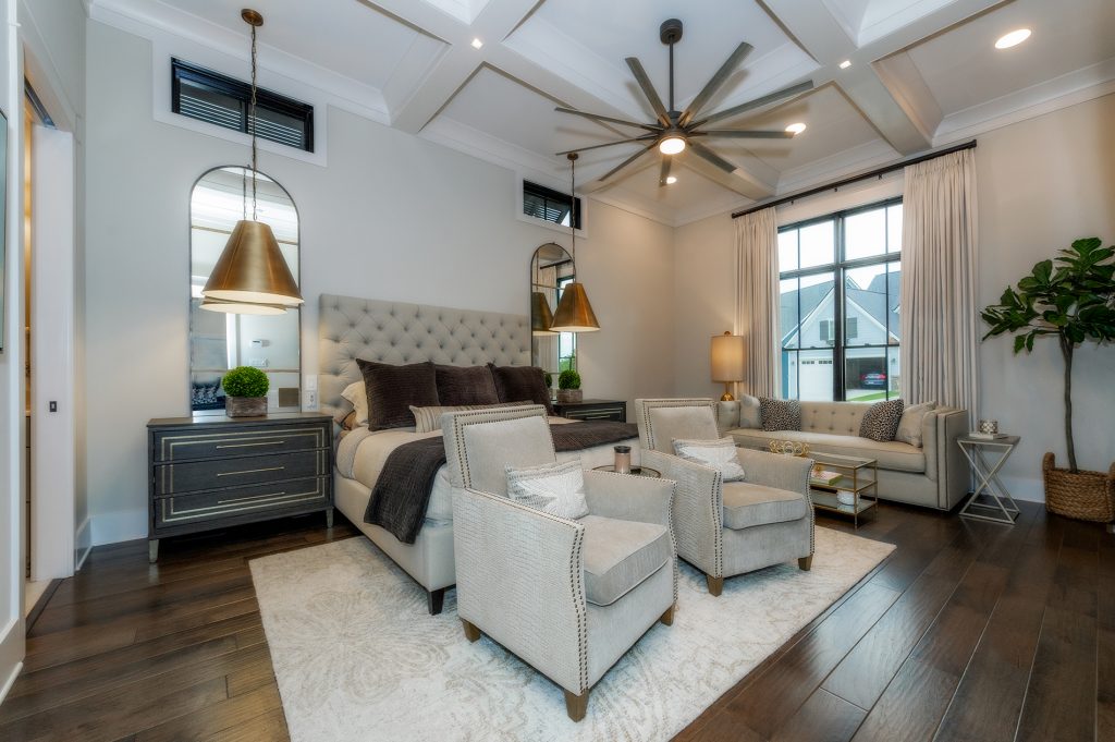
To the right of the entryway is a short hallway that leads to an absolutely gorgeous master suite. This master suite has 12-foot coffered ceilings as opposed to the 10-foot ceilings that run throughout the remainder of the house, and this extra height and light creates a cloistered feeling in the room. One side of their bedroom is “what we call the dark side of the house” says Ron, “because it is very close to the house next door.” To allow light in the room while still maintaining privacy, there are three clerestory windows at the top of that room shaded with angled Bahama shutters on the outside. Stefanie and Paige found matching gilt mirrors from 1942 at O.P. Jenkins which are mounted on either side of the bed and complemented by two oversized light fixtures. These large design elements add balance to the room and provide a beautiful focal point. Two deep reading chairs sit at the foot of the bed, and a long sofa sits beneath the street-facing windows.

The master bath has separate vanities but in a sensible design choice, Stefanie’s vanity, from White’s Marble Works and Dixie Kitchen, is significantly larger than Ron’s. The freestanding tub sits between the two vanities. The large shower is tiled all the way to the ceiling, and combined with the door from Clinton Glass, heated floors, and towel racks in the shower, it has a soothing spa aesthetic. The large window over the soaking tub has the same Bahama shutters as the bedroom. Instead of the standard large mirror, the Housers chose multiple tall narrow gilt mirrors over the vanities which keeps the room feeling modern.
The master closet and dressing area is directly off the bathroom behind a pocket door. California Closets designed the closet, and the features are really striking. The upper level clothing racks use hydraulics to allow the racks to be brought down and pushed back up with a touch of a finger. The small, sparkling chandelier from Ferguson gives the dressing area a fun and almost “Hollywood” type feeling.
Another brilliant and practical design is a pocket door opening off the other end of the dressing area leading directly into the laundry room. The cabinetry here is painted in Harbor Mist with a frosted, brushed glaze. With plenty of space for hanging clothes, this also serves as the place for their golden retriever’s food and water. A door on the other side of the room takes you down a back hallway that runs behind the living room.
The Back of the House
Walking down this short hallway, you pass the elevator to your right. Ron and Stefanie had the elevator installed after years of knee problems resulted in surgery that makes it difficult for Stefanie to climb stairs. It is beautifully designed and integrated so well into the hallway that it seems a natural part of the hall. Continue on past the elevator, and you’ll come across what would normally be called the mud room. “We put that in next to the back door,” chuckles Ron, “that nobody ever uses!” The back door leads out onto what Ron calls his “grilling porch.” Eventually the Housers plan to put a pool in the side yard. “Our hope is that our mud room will get a little more activity,” laughs Ron.
Second floor family space
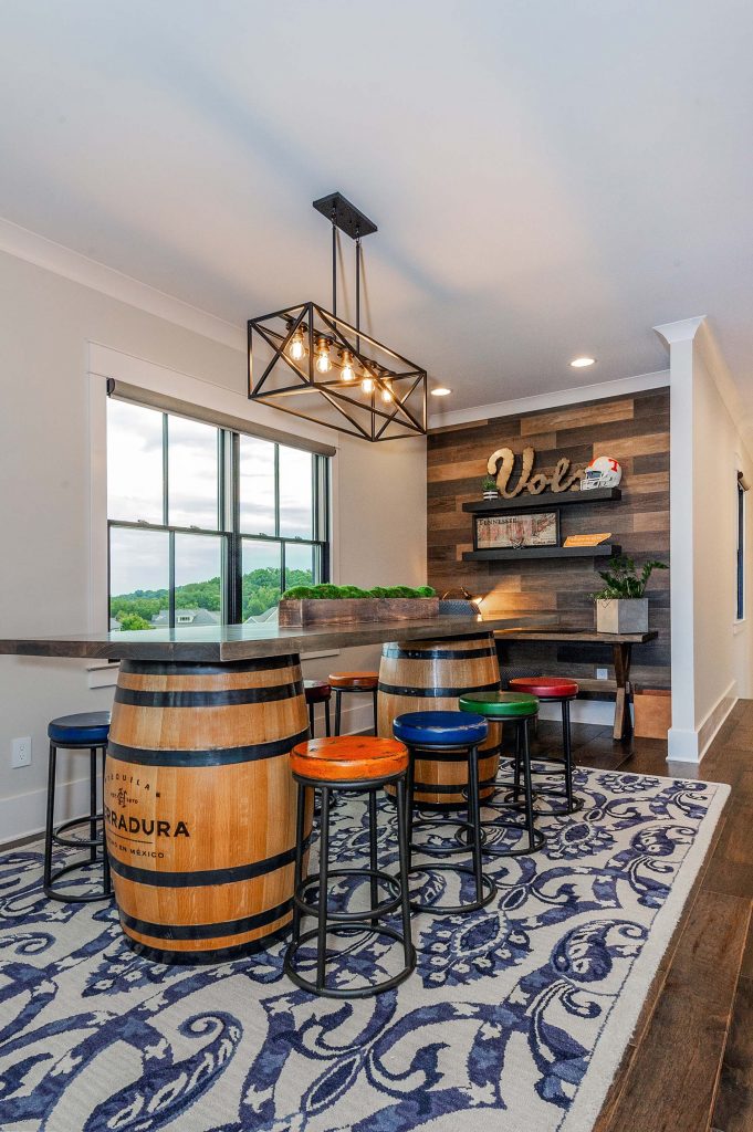
Walk up the turned staircase to the second floor “loft,” and you find yourself in a family living space and guest suite. Appointed with a large sectional sofa from Bassett and a mini kitchen, it’s a great place to watch the game or a movie. Two Herradura tequila barrels serve as the base for a long table, and the space opens upon to the “haint” blue-ceilinged porch complete with lounge chairs and Edison lights. There are two guest rooms are here, one with a full bath and the other with a full bath in the hallway. Not only a family gathering spot, it is a wonderfully sequestered guest space. You notice that the home’s color theme of cream, navy, and black are carried throughout this area as well.
Extra space downstairs
“We had to do some pretty extensive grading on the site.” says Ron. “As a result, this downstairs area has been a little bit of a bonus for us.” Moving down the turned staircase from the main floor takes you to a partially below grade area which is on the same level as the oversize garage. “I made sure to request an oversize garage with plenty of room for not only our cars but also plenty of the things that you always store in the garage,” says Ron. “This is also the place where I get to put all of my Tennessee Volunteer memorabilia,” he chuckles. This downstairs space also boasts a workout room and a generous storage room. In addition, there’s a full bath in anticipation for the day when the Housers install their pool. “Having a full bath with a shower we think will be really handy once the pool goes in.”
As you leave the home and step back out onto the street, you feel as though you’ve been a bit of a time traveler. “I really wanted the feeling of our home to be ‘Southern Comfort’,” says Stefanie. “Growing up in an antebellum home in Georgia myself, I had a very clear idea of the feeling I was after. Ron and I are so grateful for all of the people who helped us make our vision a reality.”


Comments are closed.